Blog
What Is a Line Chart?
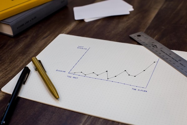
A line chart is a type of graph that uses line segments to connect data points. Line charts are often used to track changes over time, such as changes in a company's stock price or the value of a currency. Line charts, also known as line graphs, are best used to demonstrate how the value of something changes over time. Additionally, line charts can also compare how several data values have changed over time relative to each other. Line graphs can be used for a variety of comparisons or data studies and are good for simplifying data trends. Keep reading to learn more about line charts and how to use them.
What are line charts?
So what is a line chart? A line chart is a graph that shows how a particular variable changes over time. The y-axis of the graph represents the value of the variable, while the x-axis represents time. Points on the graph represent specific data points and are connected by lines to show how that data changes over time. Line charts are often used to track financial data, such as stock prices or inflation rates, but can be used to track any type of data that changes over time.
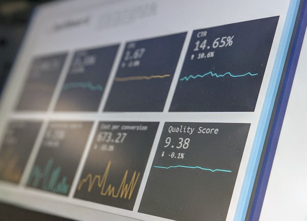
A line chart provides data visualization of where prices, profits, spending, or other quantifiable data has traveled over a given period. Because line charts usually only use finite data points, they reduce noise from less critical times throughout the data gathering process. Line charts are popular with investors and traders, marketing professionals, and business people because they provide a common snapshot of activity.
Where is a line chart useful?
As discussed, line charts are useful for demonstrating data trends over a period of time. Simple line graphs can be used across a wide range of businesses and industries. For example, publicists, brand managers, or public relations specialists can use them to track a client's social media ranking over time. Additionally, investors can rely on line graphs to track the health of their stocks and other financial interests. Finally, healthcare and public health professionals can use line graphs to get a comparison of disease trends over time.
Line graphs are used to track changes over short or long periods of time. When smaller changes exist, line graphs are better to use than other types of charts, such as bar graphs. Line graphs can also be used to compare changes over the same period of time for more than one group. They are useful for showing how different stocks, products, stores, promotions, or other things performed when compared to others.
What are some potential problems with using line charts?
As discussed, line charts are often used to track changes over time. They can be helpful for tracking trends and helping with data analytics. But while there are several ways that line graphs can be useful, there are some potential problems with using line charts. In general, line graphs are good for showing trends in data and comparing a few data sets. However, they can be difficult to read if there are too many data points. With several comparisons, a line graph can begin to look like a spaghetti plot that is difficult to read. It can be hard to see patterns or trends if the lines are all crowded together. Additionally, the scale on the vertical axis is essential and can become inaccurate in some instances. This could lead to distorted data.
A line chart is a graph that uses a line to connect data points. It is used to track changes over time or to compare data points. Line charts are a very versatile tool that can be used to visualize a variety of data.
Photo by ANTONI SHKRABA: https://www.pexels.com/photo/man-in-white-dress-shirt-sitting-beside-man-in-white-dress-shirt-5583996/
Photo Gallery


Comments